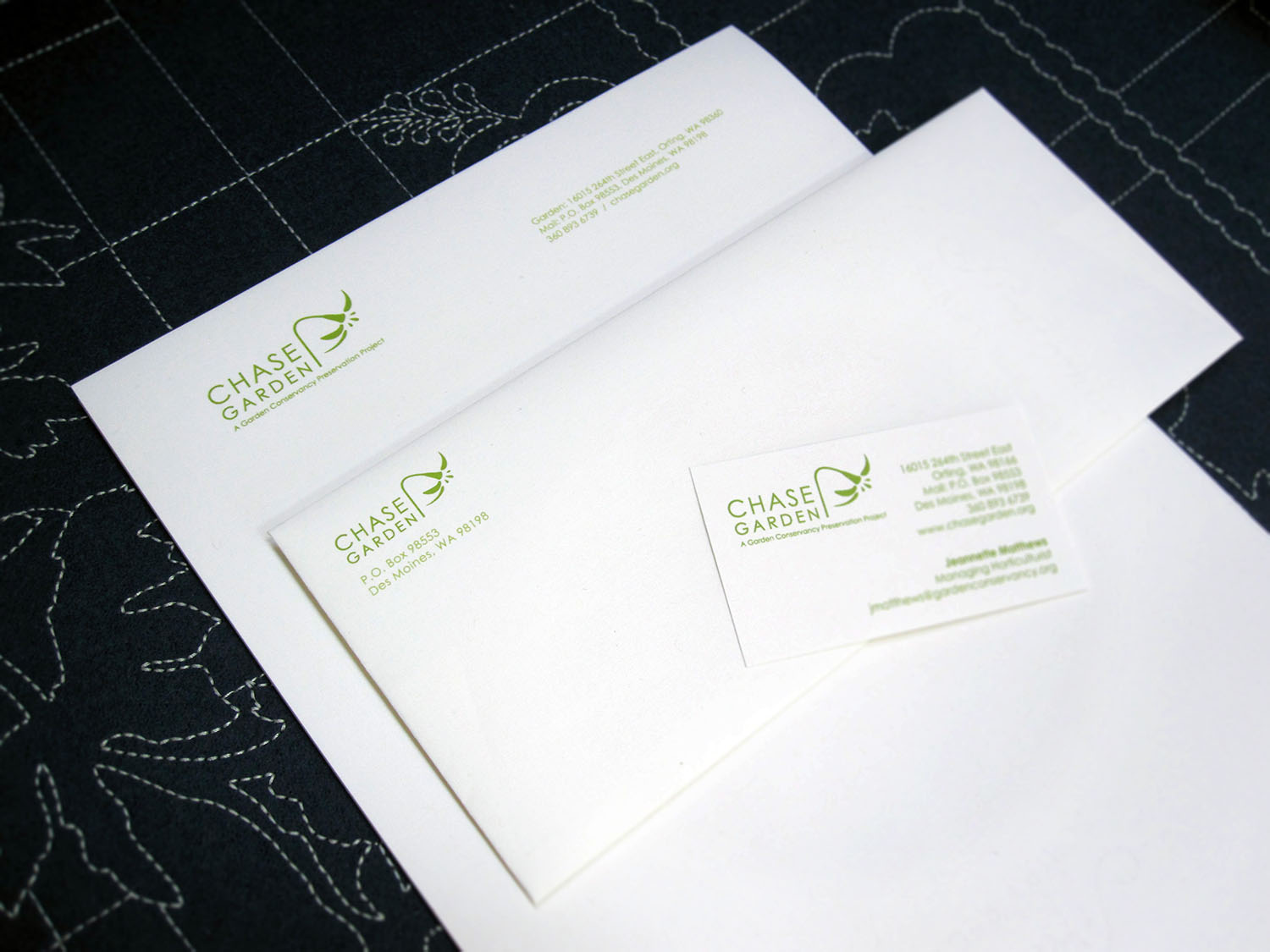
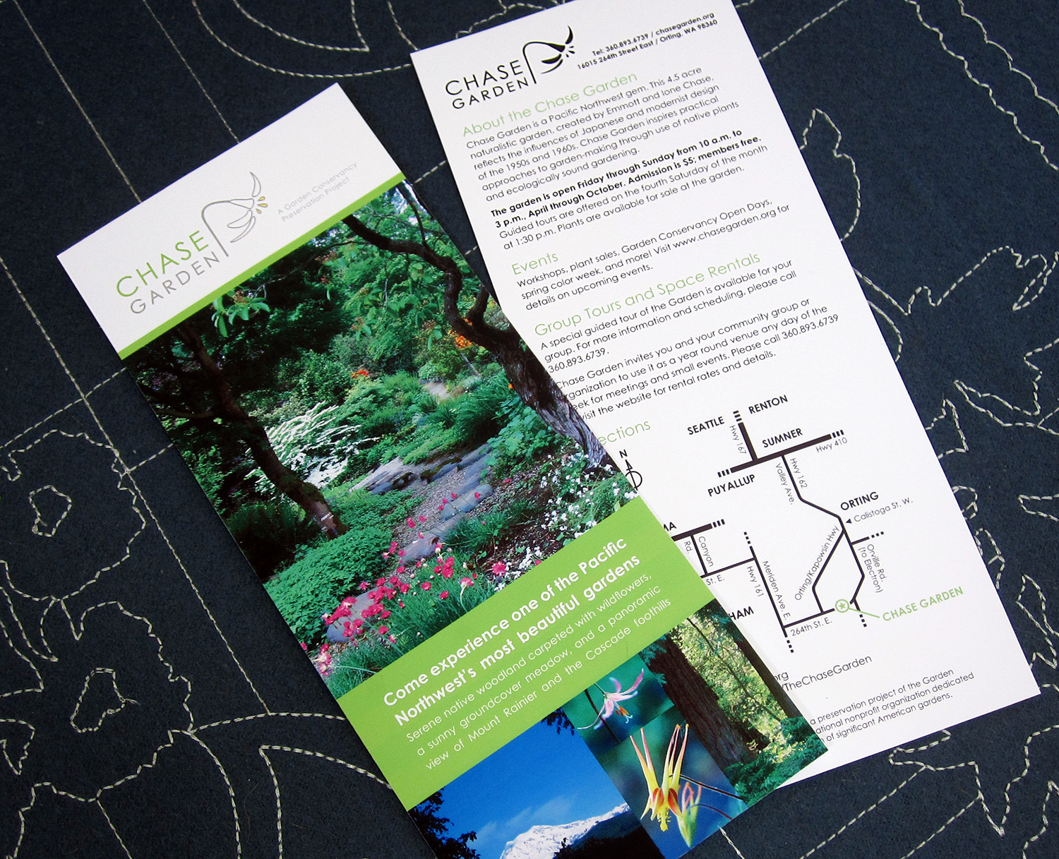
Chase Garden Logo, Signage, Letterhead & Rack Card
The Chase Garden is unique for its modernist aesthetic and sits on a bluff overlooking the Puyallup River Valley with spectacular views of Mount Rainier. Ione and Emmott Chase, the creators of the garden, drew inspiration from their love of Japanese and mid-century modern design. Ione Chase had a particular interest in textiles and Marimekko designs. I used that as the starting point in designing the logo.
The logo features an Erythronium oregonum (white fawn lily), a native perennial of the Pacific Northwest that grows happily and prolifically at the garden. The nodding stem of the lily hints at the slope of Mount Rainier.
The garden requested color variations of their logo for use depending on the season and what is in bloom.
Garden Signage
Update: Chase Garden has new owners and is no longer public. It is now only open to the public twice a year.
LP & Co Logo
LP&Co is a full-service consultancy specializing in helping non-profit organizations optimize their outreach, operations, and HR practices.
For the logo, LP (Laura Palmer) wanted to convey the friendliness, no-nonsense-ness, and comprehensiveness of her services—like a general store.
Other Logos
Aperitivo Custom Font
Aperitivo, a lovely cheese and wine shop in Grand Rapids, MI came to me with a jpeg file of their logo designed by Katherine Williams and asked me to create a font. (They had only the letters spelling out their name in hand.) I had a lot of fun designing the rest of the alphabet and other useful characters.
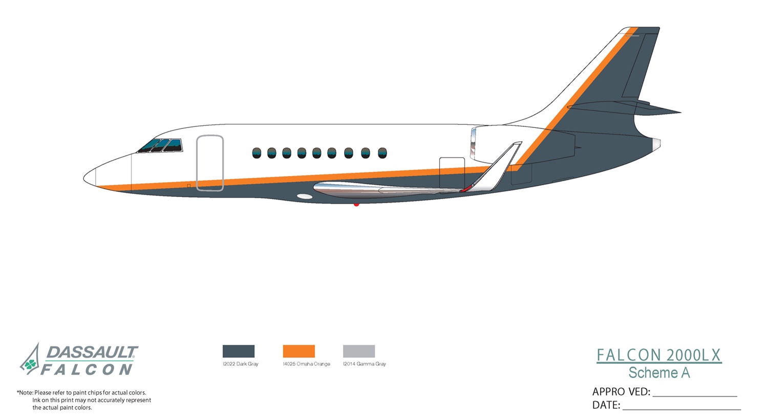
Steelcase Corporate Jet Exterior Pain Scheme
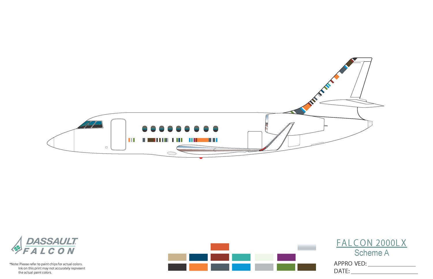
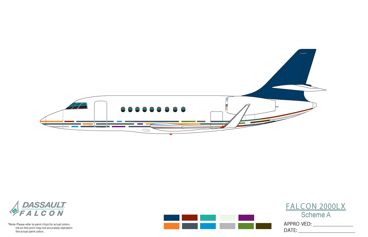
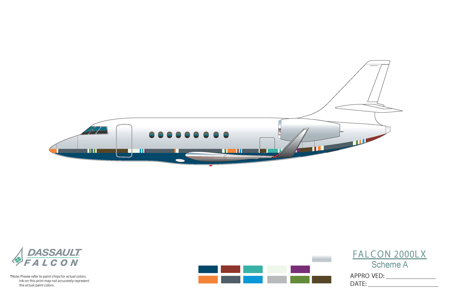
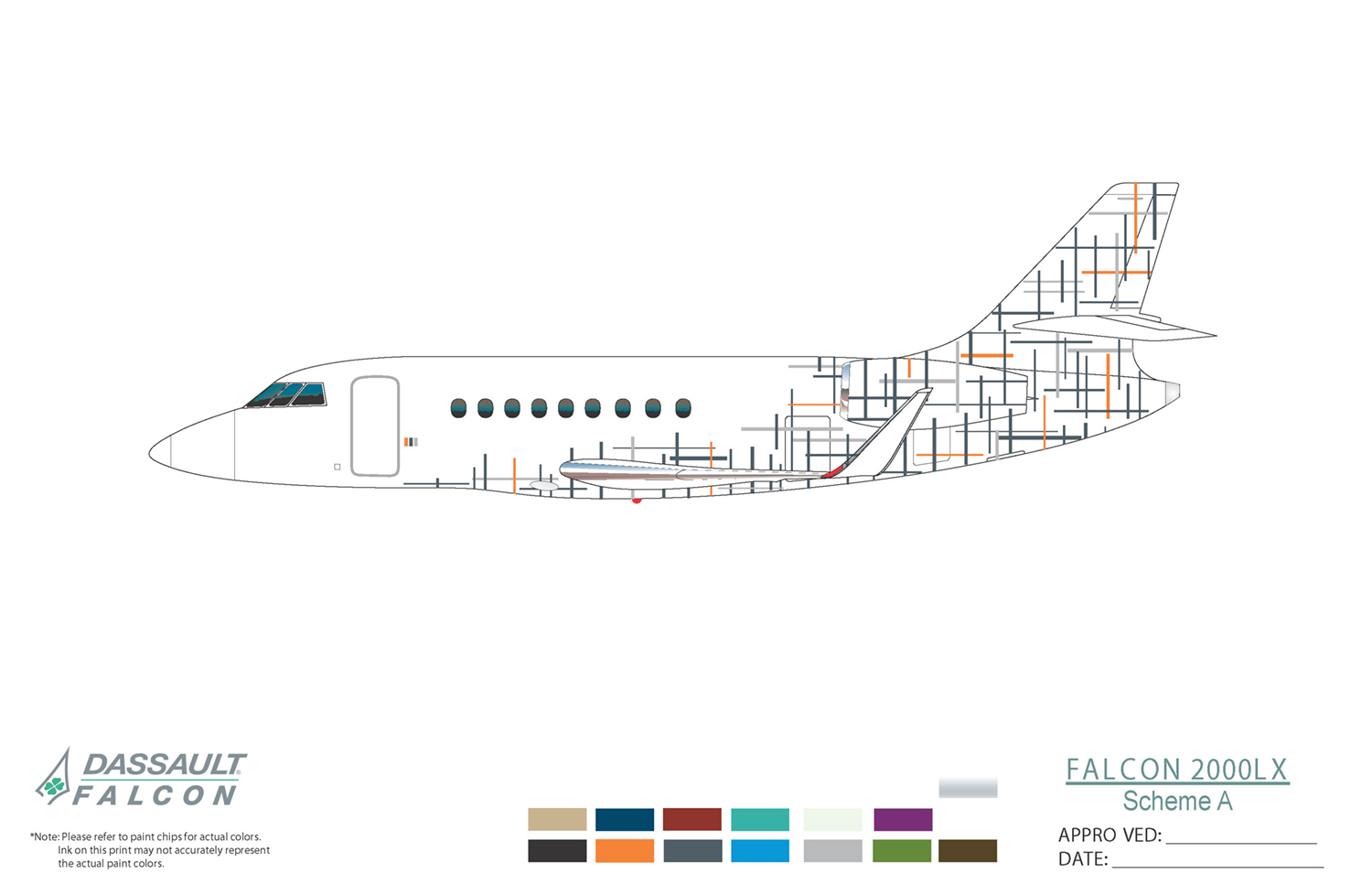
A selection of paint scheme proposals for Steelcase, Inc.
Steelcase asked for several proposals for a new paint scheme for a newly acquired jet. They wished for the exterior to complement the newly-designed jet interior, yet remain familial enough to their existing fleet of jets, shuttles, and cargo trucks.
They chose the scheme shown at the top and changed the dark gray color to a deep blue.
